fongzhuoran@gmail.com +60127200395

Illustration & Visual Narrative
This module was the free elective I chose as I was interested in creating good design, and creating good compositions in my architecture and own art projects. This was also where I learned how to use Adobe Illustrator and Photoshop.
Gallery
Vormator Challenge

Vormator Challenge was my first introduction to using Adobe Illustrator, where we had to use given shapes to create our own monster character. As we were given a lot of freedom, I decided to recreate my monsters I drew in my childhood for nostalgia, but with better execution
This was a simple alien creature with 5 eyes and tenticles for legs. with the setting on an alien planet, with the stars and UFOs in the background that fits the theme. I used red and green to put emphasis on the main monster white the surrounding in contrast used cooler and less eye catching colours for further emphasis while still trying to maintain the harmony of colours.

My approach for this piece was to use elements from traditional chinese art and express them in 2D vector form. Chang'e herself was composed of rather simple shapes that still encapsulates her beauty. Her hair flows and slowing merges with the water. The waves and her clothes flow together in harmony alongside lanterns in the sky helps give it the elegant feel I was looking for with the full moon in the background. Warmer colours were used to give the warm feeling associated with the Mid-Autumn Festival.

Minimalistic Animated Movie Poster

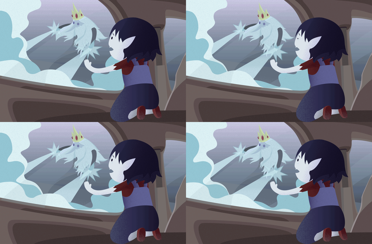
For this assignment i chose to do one of my favourite shows, Adventure TIme. I chose to illlustrate the story of Marceline and Ice King (Simon). I felt the scene where Simon became the Ice King to protect a young Marceline was the most emotional and impactful and encapsulates the tragedy of the characters.
The composition is framed from the point of view of Marcy in the car, looking on as Simon uses the power of the crown to protect her, but slowly losing himself in the process. the colours were kept pretty similar to the show, just a tone cooler. I did a simple animation of the tears of Marcy to emphasize her sadness, as well as the ice powers of the Ice King to show how the powers are overwhelming, and that it will consume Simon, finaly turning him into the Ice King . Animation was done frame by frame in photoshop

Self Titled

The final assignment we had was a self portrait, that expresses either our personalities or mood. During this assignment, I was dealing with a lot of stress from final assignments, physical and mental health issues, as well as personal relationship issues. With that in mind, I decided to express my mood at the time which is how everything is going wrong, but I still have to pull through, put a thumbs up and keep pretending that 'Everything is FIne'.
I used a picture of myself showing a thumbs up to trace over. The style I was using was still vectors, using inorganic shapes to create the facial features and hair textures. I had half of my body burned off, showing skeleton to show myself basically dying, which contrasts nicely with the slight smile and thumbs up. Fire was added underneath that represents the stresses. The quote 'Everything is Fine' repeats itself in the background where it slowly becomes more chaotic. I chose cold colours as that best represented my personality. Simple animation was done for my glasses and the fire with Photoshop

Exercises
Pathfinder Exercise

In this exercise, I was introduced to pathfinders in Illustrator which was used to cut objects into specific shapes and divide them, allowing me to recolour them into different colours to create shading, and cut the pear into pieces

Clipping Mask Exercise

Clipping mask was used to add texture onto an object. The shadow was created with pathfinders and then a clipping mask was added. This resembled pop art.


Progress Compilation
Screenshots of my process for all the projects and exercises


